Summary
Give Back is a community volunteering and charitable giving platform design to allow corporate team members to more easily connect with causes in their local area. It uses personalized results to proactively recommend events to local team members.
This product design was conducted as part of the Austin Coding Academy's Product Design Academy program. It served as the overall capstone of the course. For more details on the final design, as well as the Adobe XD file, please view this accompanying blog post.
Problem Statement
Team members do not know what community volunteering and charitable giving opportunities are going on in their local areas.
Research Data
Employees who volunteer in their local community consistently score higher on all measures of job satisfaction than those who don't. Creating a strong culture of volunteerism not only improves the company's public image, but it strongly contributes to talent retention.

Currently 52% of team members of team members engage in volunteering events. The company's 2030 social impact goal is to increase this metric to 75%. I believe with this new platform's personalized recommendations, 60% engagement would be an engaging goal to strive for.


Customer Research Survey
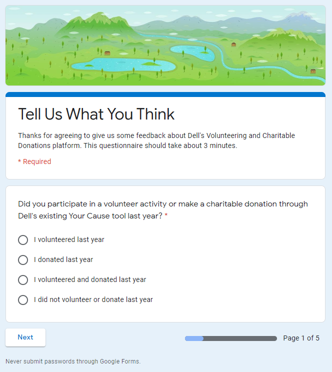
A brief customer research survey was created using Google Forms. It features branching logic to gain further insights based off of whether or not the respondent currently volunteers, or if they did not participate in volunteering events in 2019.
User Interview Questions
Additionally, a set of user interview questions were created for a moderated guided discussion. The initial hypothesis of the interviews was that users were having trouble discovering new volunteering opportunities.
- Have you volunteered in the past?
- What sort of volunteer activities do you enjoy?
- What motivates you to volunteer?
- How do you hear about new volunteer opportunities?
- Do these opportunities generally align with your interests?
- Are you satisfied with the amount of time you're donating?
- Who do you typically volunteer with?
- What do you think about our current volunteering tool?
- Do you ever donate to charities online?
- Do you use Dell's charity portal to make matching donations?
At the end of the interviews, the hypothesis was proven correct. I proceeded to conduct several additional exercises to better understand the potential applicaton's users.
Personas
Three personas were created based off of my interviews. They briefly summarize the different attitudes I encountered when it came to work-sponsored volunteering.
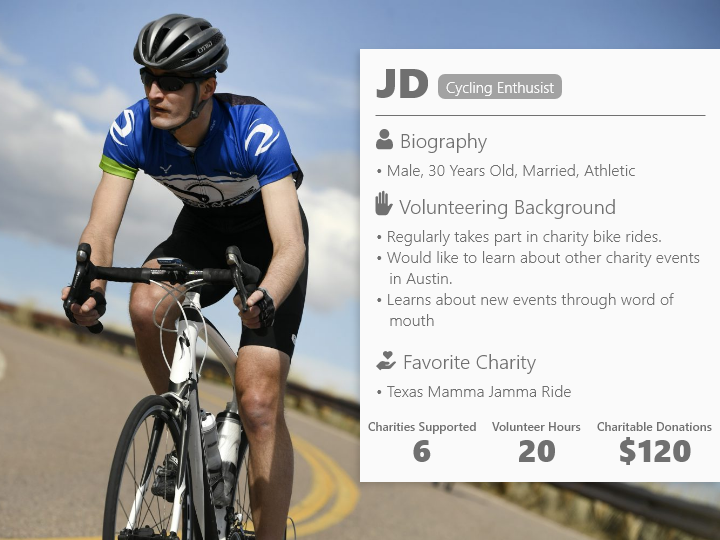
The cycling enthusiast persona was key to developing the event-driven features of Give Back. They participate in several different charity bike rides throughout the year, but volunteer in a largely cause-independent fashion.
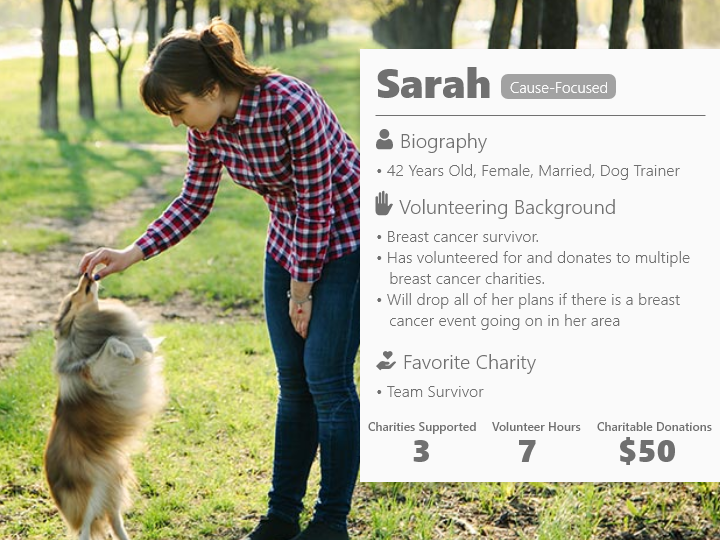
Conversely, the cause-focused volunteer is centered around a breast cancer survivor. Due to their personal connection with the cause, they will generally drop everything to participate in a breast cancer research or support related volunteer activity.
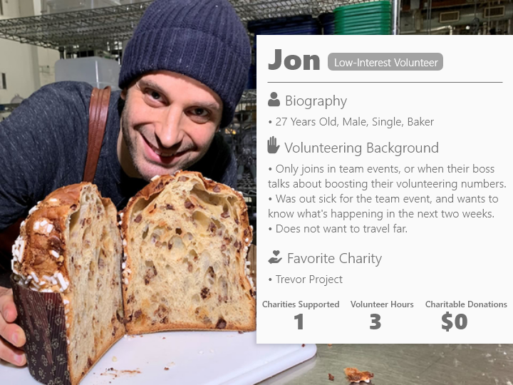
Finally, the low interest volunteer represented users who generally just volunteered during team-sponsored events. They were a useful case to study, because even though they rarely volunteered, they could name multiple charities that they felt strongly about and supported.
Empathy Map
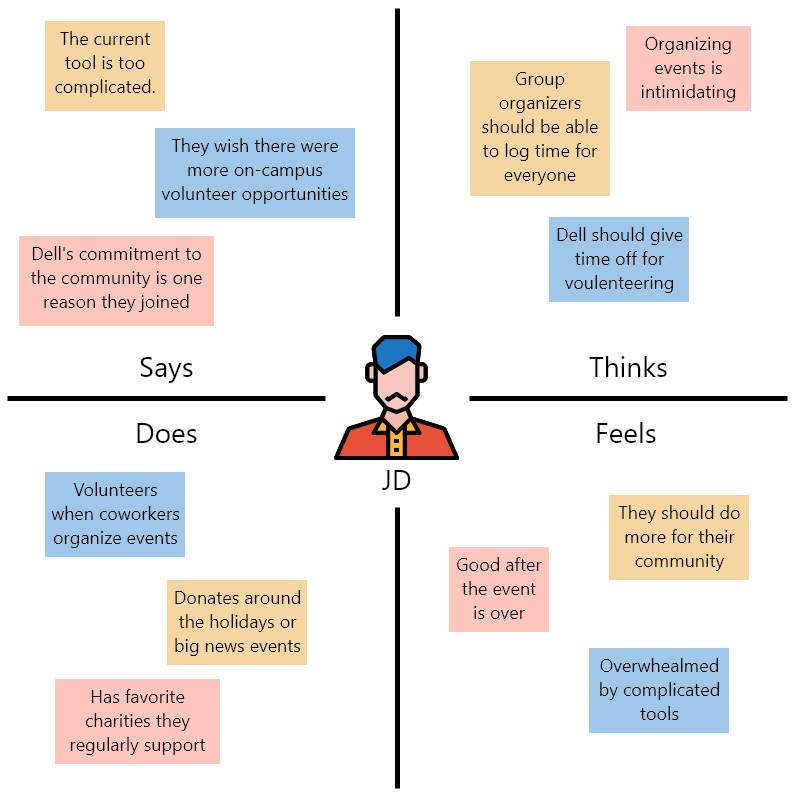
In addition to the persona exercise, an empathy map was also created for the cycling enthusiast. This alternative format to the persona card was useful for capturing the thoughts and feelings of the users I interviewed.
Journey Maps
As the last step of the user research, journey maps were created for several use cases. These design artifacts were useful when envisioning how different functionality would work in the tool.
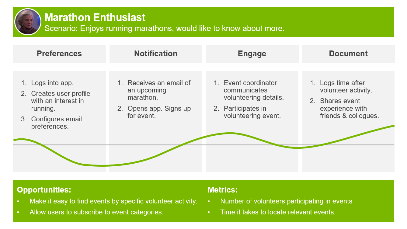
The Cycling Enthusiast knows what volunteer events they like to participate in. They're a cyclist, and want to know about upcoming charity bike rides. This user is proactive enough to log into the site well before events and register their interest. They map go the additional step of enabling email communications to hear about upcoming charity rides.
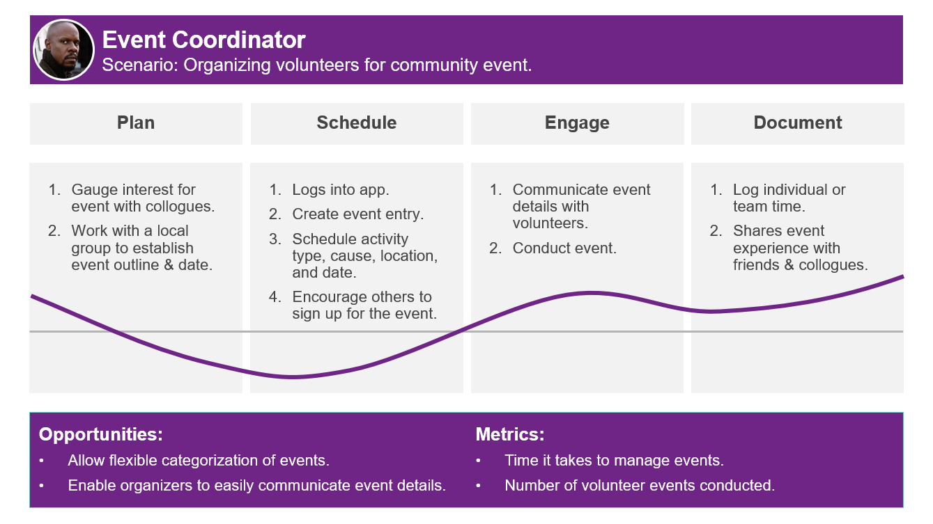
The Event Coordinator comes from the other direction. They're running a volunteer opportunity in town, and are looking to get the word out on their event. The more ways they can spread the word and engage their volunteering teams, the better.
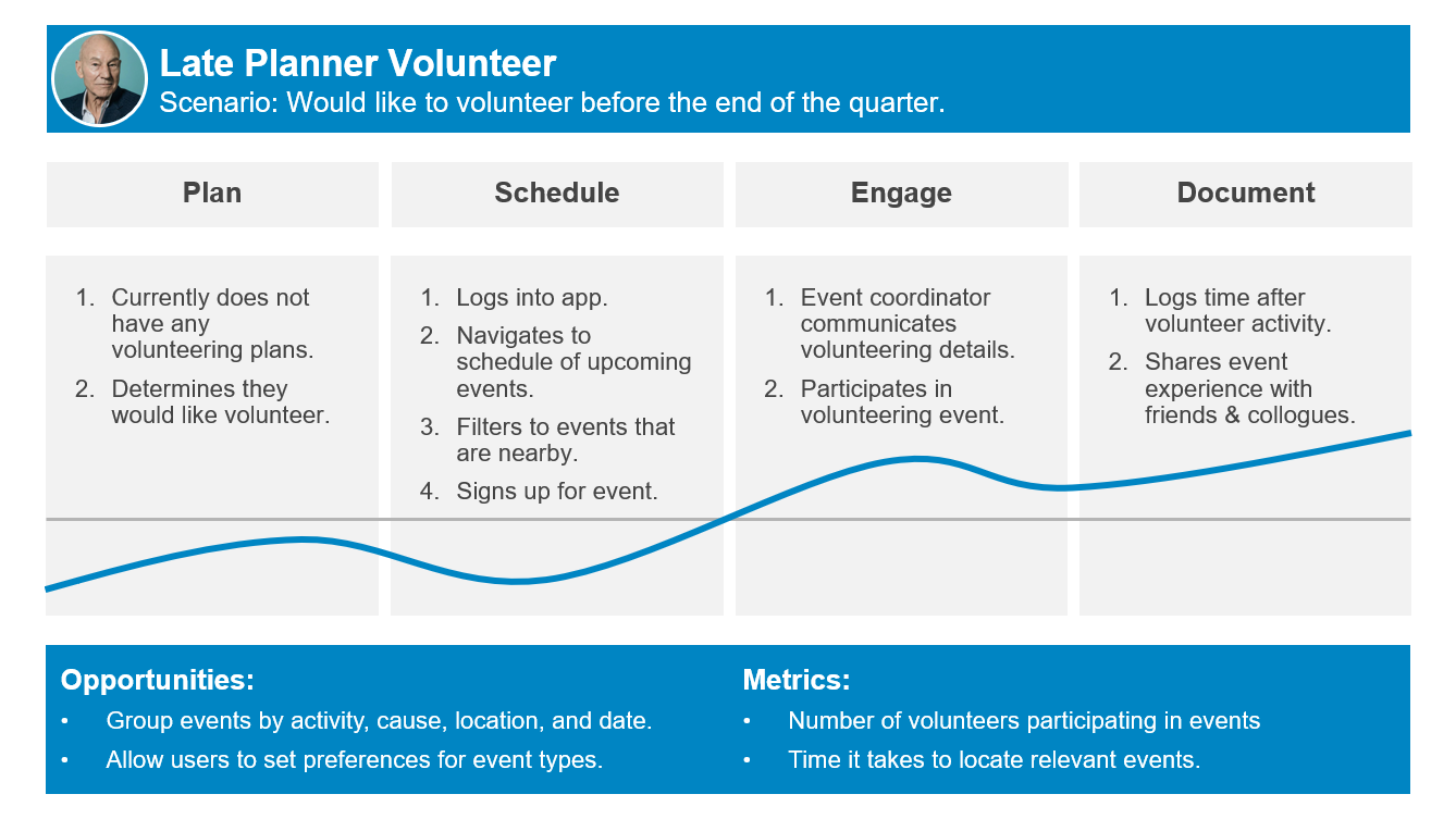
The Late Planner is not significantly engaged with community volunteering. They typically join events when their team is going as a group, or when their organization is targeting a specific volunteering goal. They primarily interact with the site when they are looking for events happening in the near future, or geographically close to their home or office.
Mood Board
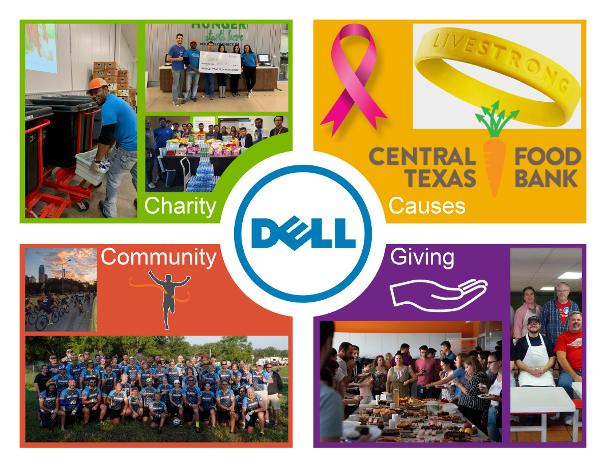
Finally, the application design process was ready to begin. A digital mood board was created with various images from past volunteering events to create an impression of what Give Back was aiming to enable.
Key Performance Indicators
In addition to the 2030 goal of getting 75% of the company's team members volunteering, Give Back is tracking the following KPIs:
- Number of volunteer activities performed.
- Number of hours volunteered.
- Number of charitable donations made.
- Amount of charitable donations raised.
- Number of employees with a personalized out user profile.
- Decreased amount of time to perform common tool actions.
Sketches
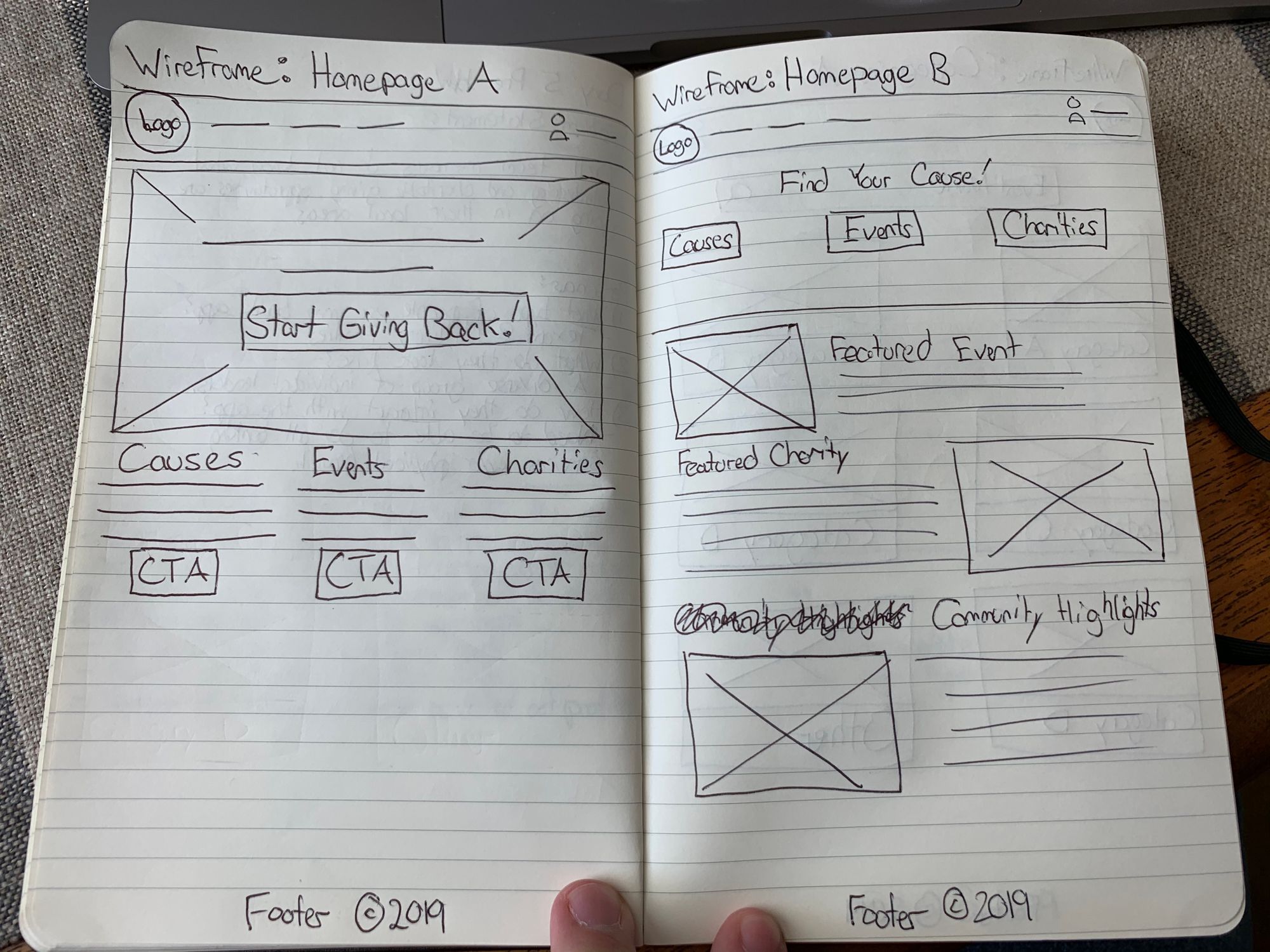
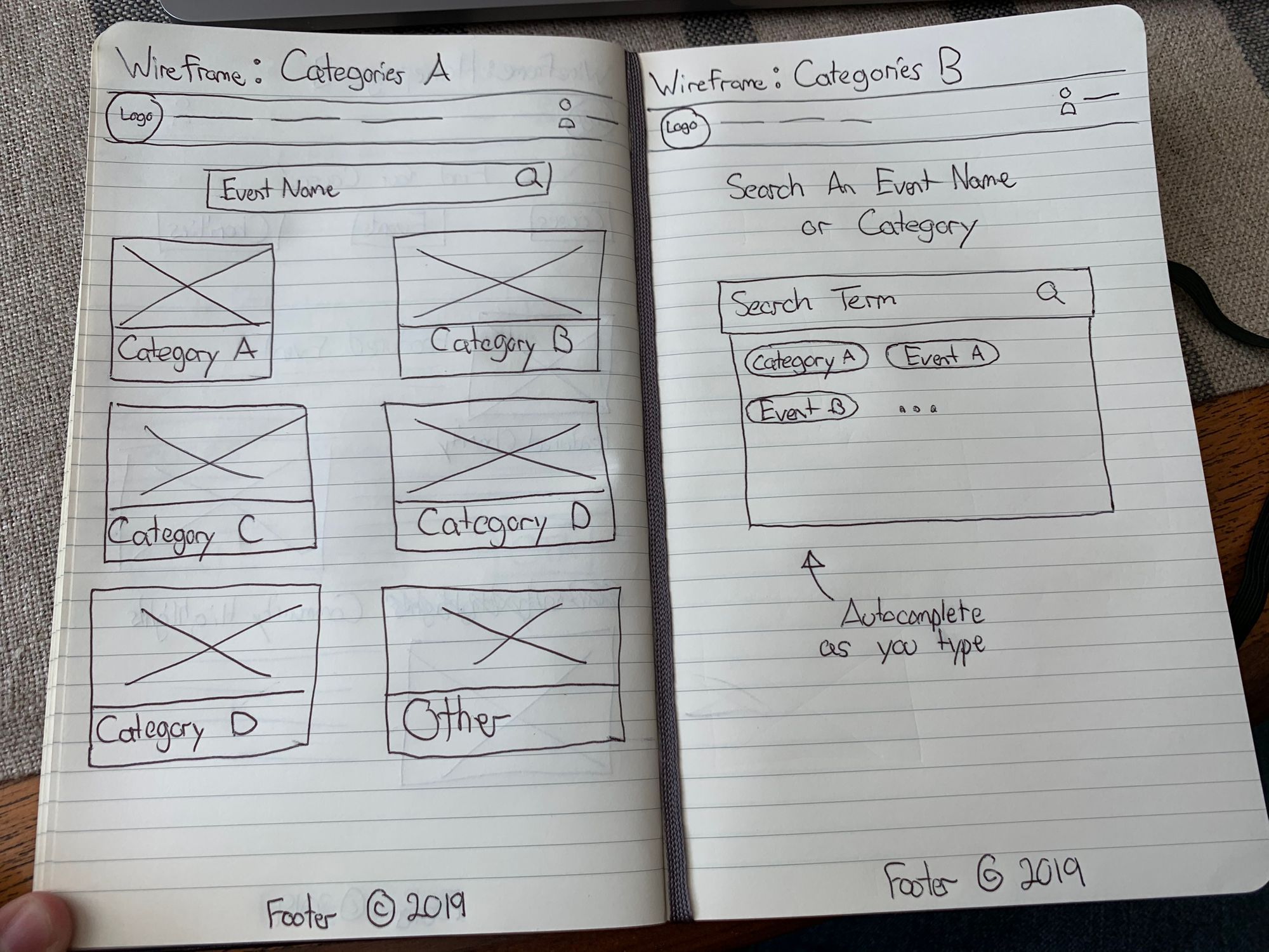
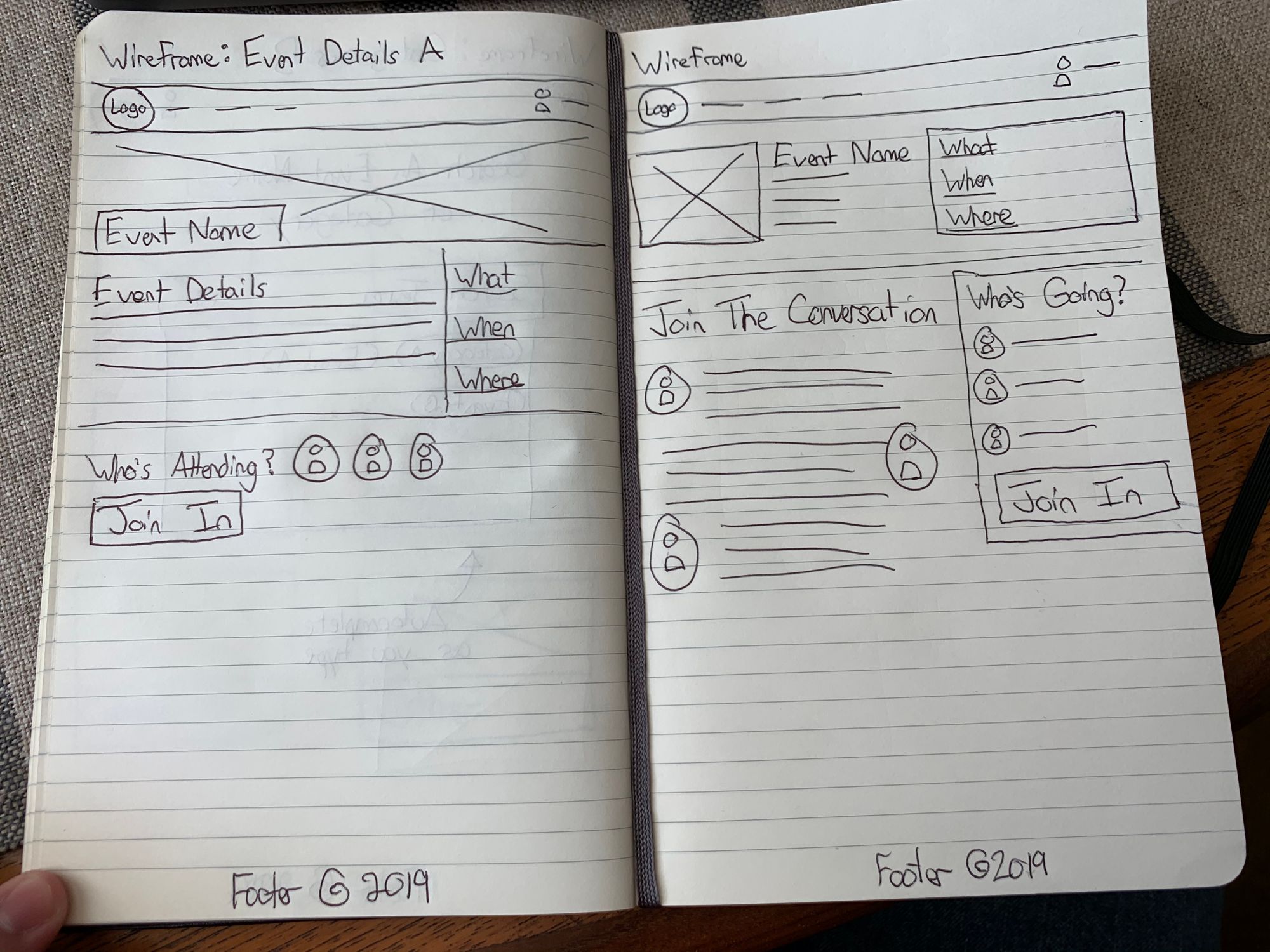
I created several pen-and-paper sketches of key pages of the application. These sketches tested several different layouts, such as a list-based category page and a search-based category page.
Lo-Fi Wireframes
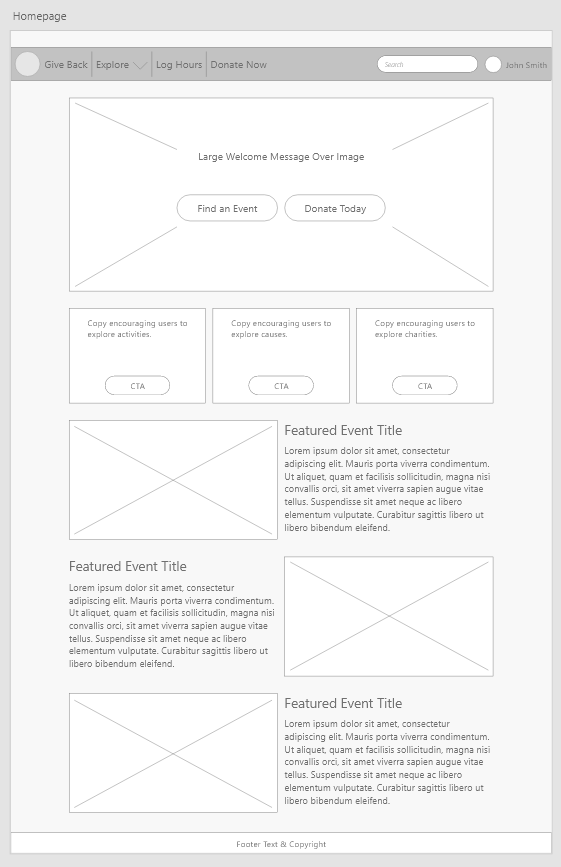
Once the general idea was sketched, I created a set of lo-fi wireframes using Adobe XD. These wireframes allowed me to test and prototype different interactions. If you would like a closer detail of my lo-fi wireframes, they're avalible on the Adobe XD preview site.
Design System

Before the hi-fi wireframes could be created, I needed to determine which design system or UI framework I would be working with. As part of this product design exercise, my course was also giving us an opportunity to work with a real-world corporate design system. My Give Back design mockup uses the Dell Design System for it's branding guidelines and core components. I also created a few additional volunteer-centric components which did not exist as part of the Dell Design System.
Hi-Fi Wireframes & Prototype
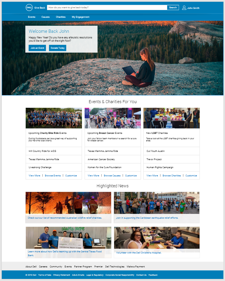
The final high fidelity wireframe for the Give Back project was once again created in Adobe XD. The tool made it quick and easy to test different page designs, as well as work with Dell Design System components. The high fidelity wireframes focus on five key pages of the application, demonstrating a straightforward user flow for joining an event. If you'd like to browse the full mockup, it is available on the Adobe XD preview website. Additionally, I've created a dedicated blog post to discuss the final design of the site, and the way the different portions of the site are structured.
Elevator Pitch
Now that the overall Give Back design had been created, I still needed to be able to successfully pitch the idea. The first component was a 30-second elevator pitch succinctly summarizing Give Back's value proposition and differentiating factors.
Dell Give Back is a community engagement and charitable donation platform designed to engage Dell team members with their local area. It gives personalized recommendations based on the types of events users like to perform, the charities they like to support, and the causes they care the most about. This new platform not only supports its Legacy of Good goals, but it helps support Dell's people strategy as well. Employees who are engaged with their community score higher across every job satisfaction metric.
Pitch Deck & Presentation
The last asset created for the Give Back product design was a basic pitch deck. At the end of the course, we were each given a five minute time slot to present our work. I created my presentation within Adobe XD, so the interactive mockup could be embedded with the slides.