Bootstrap 3's documentation is good at showing you how to use its grid system, but it's not that great at telling you when or why you might want to use some of the grid system's various features. This abridged guide is going to try and help fill in some of those gaps, and point out some beginner pitfalls of the Bootstrap grid.
Wrappers
Before we can get started discussing the grid itself, we first need to briefly go over some of Bootstrap's wrapper elements. Bootstrap offers two primary page wrappers .container and .container-fluid. .container has a fixed width, while .container-fluid always take up the full width of the page. Bootstrap expects one of these two divs to be wrapped around your page's primary content. The grid system won't work without it.
One of the common pitfalls with Bootstrap's .container is not knowing when to break them up into separate elements. It's rare that you'll just have one container covering the entire page.
<html>
<body>
	<div class="container">
		// This rarely happens.
	</div>
</body>
<html>
<html>
<body>
	<nav class="navbar">
		<div class="container">
		</div>
	</nav>
	<div id="main">
		<div class="container">
			// Main content goes here.
			// The typical Bootstrap layout has a few containers.
		</div>
	</div>
	<div id="footer">
		<div class="container">
		</div>
	</div>
</body>
</html>
The second wrapper is a much shorter discussion. When working with the grid system, you need to place your grid within a .row div. The Bootstrap documentation dedicates all of 6 words to this vital point. Place grid columns in any .row.
The Grid
Alright, with wrappers out of the way, we can move onto the grid itself. The Bootstrap grid system has 12 column slots that are typically displayed side-by-side. It uses CSS media queries to stack these columns on top of each other when your browser window gets small enough to pass a certain breakpoint.
<html>
<body>
	<div class="container">
		<div class="row">
			<div class="col-md-1">.col-md-1</div>
			<div class="col-md-1">.col-md-1</div>
			<div class="col-md-1">.col-md-1</div>
			<div class="col-md-1">.col-md-1</div>
			<div class="col-md-1">.col-md-1</div>
			<div class="col-md-1">.col-md-1</div>
			<div class="col-md-1">.col-md-1</div>
			<div class="col-md-1">.col-md-1</div>
			<div class="col-md-1">.col-md-1</div>
			<div class="col-md-1">.col-md-1</div>
			<div class="col-md-1">.col-md-1</div>
			<div class="col-md-1">.col-md-1</div>
		</div>
	</div>
</body>
</html>
Large Window:

Small Window:
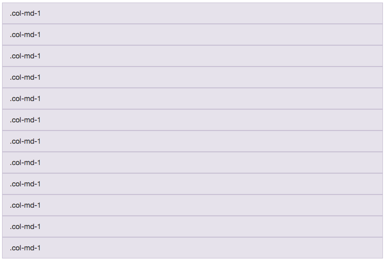
You can set which breakpoint you'd like the columns to start stacking at by changing the variable in the middle of the column. .col-lg-1 is shown side by side with the other columns when the browser is 1170px or larger, .col-md-1 shows side by side with other columns when the page is 970px or larger, .col-sm-1 shows side by side with other columns when the page is 750px or larger, and .col-xs-1 is always shown as a side-by-side column. Columns using .col-xs-1 will never be stacked, no matter how small the browser window gets.
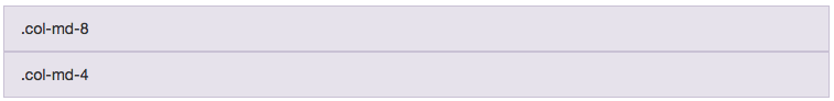
Of course, page layouts are almost never twelve individual columns of content. Most page layouts take advantage of about two or three columns. To create a layout with only a few columns, we'll need to adjust the size variable at the end of our column class. Instead of using 12 .col-md-1 columns, we'll use just two columns: .col-md-8 and .col-md-4. The number at the end represents how many columns wide a div is. For most layouts, you'll want all of your column sizes to add up to 12.
<html>
<body>
	<div class="container">
		<div class="row">
			<div class="col-md-1">.col-md-8</div>
			<div class="col-md-1">.col-md-4</div>
		</div>
	</div>
</body>
</html>
Large Window:

Small Window:
Columns can have different sizes at different breakpoints. Take for instance the .col-md-8, .col-md-4 layout shown above. If you wanted the .col-md-4 sidebar to render narrower on a smaller screen, you should just add the sm class after the md class. .col-md-8 .col-sm-9 and .col-md-4 .col-sm-3 would feature a thick sidebar at lg and md breakpoints, a narrower sidebar at the sm breakpoint, and would stack at the xs level. Just remember that you still would generally want your columns to add up to 12 at whatever size they're at.
Column Wrapping
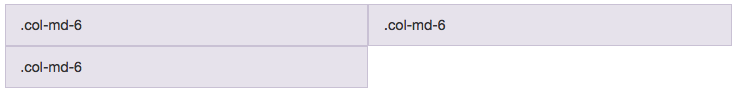
There is one exception to the add-up-to-12 rule, which the "Column Wrapping" section of the Bootstrap docs tries to explain. If you've got a .row that is more than 12 columns wide, the overflow columns will be wrapped around to the next line. A trio of .col-md-6 columns would render as two boxes side by side, with a third box underneath the first. This technique is useful for when you're rendering n items from a database, and don't know how many items are going to be retrieved. You'll frequently see it used in galleries and similar layouts. The overflowed columns will still stack on on small screens as before.
<html>
<body>
	<div class="container">
		<div class="row">
			<div class="col-md-1">.col-md-6</div>
			<div class="col-md-1">.col-md-6</div>
			<div class="col-md-1">.col-md-6</div>
		</div>
	</div>
</body>
</html>
Large Window:
Small Window:
Offset Columns
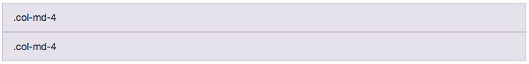
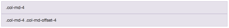
Offset columns are fairly straightforward. They create a gap in your column layout. .col-md-4 and .col-md-4 would usually create two blocks that are four columns wide, with a four column wide space after the two blocks. If you instead have a .col-md-4 div and a .col-md-4 .col-md-offset-4 div, the second block will be pushed over 4 spaces. The page will render with a block 4 columns wide, a space 4 columns wide, and then a block 4 columns wide. The xs/sm/md/lg sizing in the col-*-offset-4 div refers to what screen size the offset should happen on. The divs .col-sm-6 .col-md-4 and .col-sm-6 .col-md-4 .col-offset-4 will be stacked on xs screens, side by side on sm screens, and separated by a 4 column gap on screens md and above. I don't really use this feature much, but it can be useful for certain layouts.
Large Window:

Small Window:
Large Window:

Small Window:
Nesting Columns
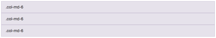
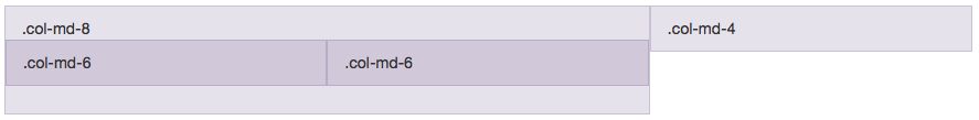
Nesting columns is one of the tricky mental leaps to make with grid systems. It's often not strictly necessary, but can help logically separate your page better. For instance, if your page layout has a main content area and a sidebar, you'd probably use a .col-md-8 and .col-md-4 div. If for whatever reason you needed to break your main content area up into another pair of equal divs, you generally would not want to change the page layout to be a .col-md-4 .col-md-4 .col-md-4 grid. Instead, you would want to keep the .col-md-8 .col-md-4 layout, and nest a new grid inside of the main col-md-8 content area. The nested grid will need its own .row element, but it doesn't need another .container wrapper.
<html>
<body>
<div class="container">
	<div class="row">
		<div class="col-md-8">
			<p>.col-md-8</p>
			<div class="row">
				<div class="col-md-6">
					.col-md-6
				</div>
				<div class="col-md-6">
					.col-md-6
				</div>
			</div>
		</div>
		<div class="col-md-4">
			.col-md-4
		</div>
	</div>
</div>
</body>
</html>
Large Screen:
Small Screen:
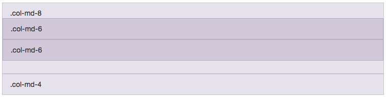
The new nested divs still needs to add up to 12, not the width of the parent column. After all, you're creating a whole new set of columns. So inside of your .col-md-8 column's .row wrapper, you would want to put a set of .col-md-6 .col-md-6 divs. If you wanted to make the main content area temporarily have three columns, you'd instead use .col-md-4 .col-md-4 .col-md-4, etc.
Column Ordering
Finally there's column ordering. When using Bootstrap's grid system, your columns will be displayed in the order they're declared. When unstacked, they'll be shown in order from left to right, and then they're stacked they'll be shown top to bottom. The only way to change the stacking order is to change the order in which your columns are declared in your HTML code.
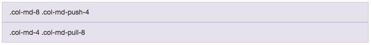
In the unstacked, side-by-side view however, it is possible to change the order of the columns. Using the .col-md-8 .col-md-4 example from before, let's say that you wanted the col-md-8 column to stack on top of the .col-md-4 column, but you wanted the .col-md-4 column to render on the left of the .col-md-8 column when on larger pages.
To do this, you would need to use the .col-md-pull-* and .col-md-push-* helper classes. By changing your columns to .col-md-8 .col-md-push-4 and .col-md-4 .col-md-pull-8, the larger column would be pushed out an extra 4 column lengths, and the smaller column would be pulled in 8 column lengths. The end result would be that the columns would switch places when viewed at md breakpoints and above.
<div class="row">
	<div class="col-md-8 col-md-push-4">.col-md-8 .col-md-push-4</div>
	<div class="col-md-4 col-md-pull-8">.col-md-4 .col-md-pull-8</div>
</div>
Large Screen:

Small Screen:

Large Screen:

Small Screen:
Conclusion
I hope these explanations make sense. It can take a while to get used to combining all of these different techniques together. Make sure to check out the Bootstrap documentation to see some of the more advanced options I didn't have a chance to go over here.